Bounce rate is defined as the total number of visitors registering one hit per session divided by the total number of hits to your website. In layman’s terms, it is the percentage of users who exit a site without visiting a second page.
Bounce rate is one of the many key performance indicators, or KPIs, that you can use to monitor and assess site traffic. It tells you how welcoming, relevant, and accessible your website is.
Though bounce rates tend to fluctuate greatly depending on a number of factors, there are elements to consider when digging into the reasoning behind a particularly high bounce rate. (Hint: first impressions are everything!)
1. Poor “above the fold” content.
This term was coined back in the day when commonfolk bought newspapers off of street-side carts (crazy, huh?), and defines the importance of an enticing headline and strong front page. Today, this concept stands true in the digital world – except instead of newsprint, this fold is precisely 600 pixels, or to the bottom of a browser window.
Without needing to scroll, a webpage’s purpose should be clear. Is the page title or heading placement dominant and easy to understand? Does the page contain a call-to-action (CTA)? Are graphics striking, but not distracting?
If your webpage doesn’t immediately grab the user within moments, you could risk a bounce. Because of its high visibility, the content that you place above the fold should be the content that is most important to achieving the page’s goals.
2. The navigation is not so navigable.
The structure and labels of your website’s top navigation, usually referred to as the “navigation bar”, can have a large impact on user experience.
A website’s navigation bar is essentially its directory, helping to guide users and point them in the right direction. It must be simple and familiar. Avoid ornate wording. Stick to a hierarchical, left-to-right order, placing the most important first and categories such as “Careers” and “Contact” last. If you fall over 7 menu items, reevaluate your navigation structure and consider consolidating. Have a large e-commerce site? Options like a mega-menu or a breadcrumb trail may work best.
A well-organized navigation is the key to a smooth website visit. If users cannot easily and quickly find what they’re looking for, your bounce rate could certainly jump.
3.Non-responsive design.
Back in 2016, for the first time in history, the combined number of mobile and tablet users surpassed the number of desktop users globally, proving device compatibility is absolutely necessary when it comes to web design.
If your website does not seamlessly respond to every screen size or resolution, you are missing out on a huge chunk of potential traffic. Have you ever landed on a non-responsive website using your smartphone? Pinching and zooming aren’t fun. Do your website visitors a favor and be sure your website is inclusive and fully responsive. (Your SERP rankings may thank you, too.)
4. Outdated technology.
In the same vein, a website’s modernity, or lack thereof, plays a large role in both usability and a company’s reputation. Your first-time visitors are judging you – and it takes only a matter of seconds to draw conclusions. .05 seconds, to be exact, according to recent studies.
Design dating back to 2010, outdated photos, and embedded videos using Flash or other non-compatible video hosting are all elements that could turn users away. In short, outdated technology tells your users that you simply do not care.
“They’re a great company, but they have such a horrible website”: it’s a more common stance than you think. A new, upgraded website is a must for any business no matter the size.
5. Slow site speed.
Though page load speed is an important factor in any website’s user experience, it is often overlooked to make room for intricate animations and other bells and whistles.
Slow load time is reported to be the number 1 reason why visitors bounce from a site. According to surveys done by Gomez.com, almost half of web users expect a site to load in 2 seconds or less, and 79% of web shoppers who have trouble with website performance say they won’t return to that site to buy again. In our fast-paced digital world, speed is key – and if you are an e-commerce site, it could cost you thousands of dollars in lost revenue.
6. No “About” page.
Contrary to popular belief, your customers are not just buying your products or services. They’re buying you. Your flannel-lined sleeping bags could be made of the highest-quality organic fabrics, with a selection of 20 different colors, 100% hand-woven by Grandma Deb, but your customer could easily bounce if they have no face to place with the name.
Without a brand story, you’re just another Amazon seller, and that infamous sleeping bag can be purchased from the guy next store for $40 cheaper.
Your “About” page should not only explain your company’s mission but give a peek inside the history of the company. When did you get started? How did you get started? What makes you different – better – than your competition? With About pages, you get a chance to tell your story. Tug on some heartstrings, but stay humble.
7. Hidden contact information.
Failing to have prominently-placed, accessible contact information on your website could cost you a lead, fast. Not only does accessible contact information increase usability, it also secures your legitimacy and trustworthiness.
In general, users tend to look toward the upper righthand side of a webpage – the last item in the navigation – for a Contact page. Be sure your Contact page includes a quick intake form (see #10!), your phone number, and physical address. For extra coverage, add your social media links and a general inquiry email such as info@. Giving users multiple methods to choose from increases the likelihood of them actually contacting you.
8. Low-quality content and page layout.
One of the most crucial elements of a well-performing website is content.
If your page content is stale, sparse, irrelevant, contains typos, and doesn’t incite action, users will quickly lose interest. Remember: quality content, when combined with great page design, instills credibility.
Together, these aspects must represent your company’s brand. It should be clear what your company, product, or service provides and the emotion it conveys – from typography down to color scheme. Always consider your audience’s demographic, age group, and needs.
9. Content overload.
Perhaps the only thing worse than a dull website is an overwhelming one. If your webpage contains too many calls-to-action, unnecessary images, long paragraphs of text, an overabundance of buttons, distracting pop-ups – simply too much stuff – users won’t even know where to begin.
“Overchoice inhibition”, or choice overload, is a cognitive process in which people have a difficult time making a decision when faced with too many options. It happens in daily life and it most certainly happens in web design. We’ve said it before and we’ll say it again – KISS. Keep It Simple, Stupid.
10. Too much manual work.
Asking too much of the user tends to decrease the importance of the task at hand. If a Contact form is too long or an account login is required to purchase a product, their interest can quickly diminish.
Are you sending a whitepaper? Only ask for name and email. As an e-commerce site, always offer guest checkout, and be sure the checkout process is simple and streamlined. Communicate errors clearly and in real-time. When instructing your user through steps, only include those that are absolutely necessary. Think about it this way: is the additional information you gain from this additional field worth losing people?
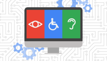
11. Lack of accessibility.
Website accessibility is the practice of removing barriers that prevent interaction with a website for users with visual, hearing, motor, or cognitive disabilities. Technological advances have given us access to a variety of tools including screen readers and font resizers to ensure every user has the chance for a smooth, uninterrupted web experience.
More than a third of U.S. households include someone who self-identifies as having a disability according to the Essential Accessibility coalition. For as long as you maintain a website, accessibility should always be at the forefront of your digital marketing plan.
To learn more about website accessibility standards, check out w3.org or ada.gov for Americans with Disabilities Act guidelines.
Always remember that there is no perfect bounce rate, nor a surefire reason behind any page’s bounce rate. Bounce rates vary from industry to industry and the type of landing page at hand. In general, you should focus on improving your bounce rate in comparison to your own historical bounce rates.
For more advice on improving your website’s performance, check out this post from Hall!

 Subscribe via RSS