When building email marketing campaigns, there are a considerable amount of variables when it comes to marketing strategy and technicality: audience & segmentation, subject, valuable content & imagery, automation, and deliverability to name a few.
Something that is often overlooked is the preheader message.
Preheader? What is that?
The “preheader” is the text following the subject line often referred to as “preview text.” You’ve probably seen the short summary text following the bold (when unopened) subject line. This preview text snippet is typically pulled from the body of your email or implemented with the preheader. It will be visible in the inbox but can either be visibly displayed or hidden when viewing the actual email.
Fun Fact: The preheader, also known as “The Johnson Box” was a concept invented in 1941 by Frank H. Johnson. Frank, who had worked for Time, Inc. in direct mail, had been looking for a new way to grab readers’ attention. Thus, the Johnson Box, a persuasive paragraph before a letter’s greeting came into practice.
Think of your email in the inbox like a piece of real estate. Let’s say you own a 5 unit apartment building and are looking to make as much profit as you can. Would you rent out only 3 of the 5 units? Probably not. So why ignore the “real estate” you’re given in email? Yet marketers still ignore or poorly implement using the preheader space.
According to Litmus, a leader in email marketing, after surveying users they found that 24% of those surveyed look at the preview text first when deciding to open an email.
Let’s take a look at a desktop inbox – Outlook:
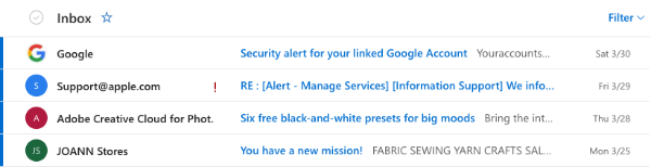
You can see at least 3 here are using the preheader.
- Google is using one but it looks like there is a slight typographical error with no space between “Youraccounts”—even the big guys make mistakes, too. 😉
- Apple Support has a subject line that is too long to view whether the preheader exists.
- Adobe appears to do a good job, though we are unable to see the full text. But, their subject line is very straightforward.
- JoAnn could use some improvement. The “FABRIC SEWING YARN CRAFTS” are the menu items you see when you click into the email. It doesn’t tell you anything about the “new mission” in the subject line.
Now you might be thinking based on the screenshot that the preheader isn’t too important since you can’t really read it much if the subject line is taking all the attention. Remember, almost 1 in 4 people consider the preheader when opening an email. This brings us to the next point—the user’s device.
Let’s think about the user and the device they are using to view email. As of today, the majority of emails are now opened on mobile devices coming in at 59% according to eMailMonday. With that said, we’ll take a look at the mobile inbox with the most market share, Apple’s iPhone Mail on an iPhone 8 Plus.
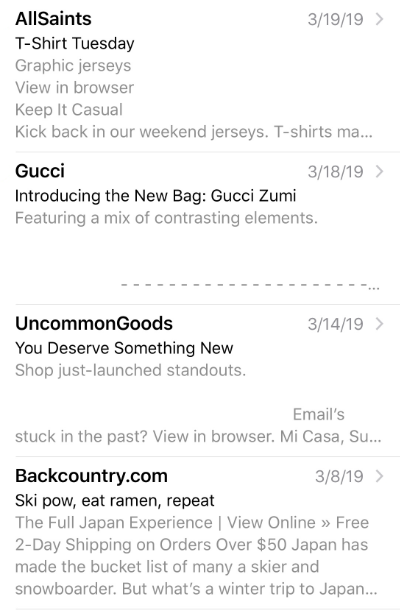
Here you can see significantly more “real estate” than on desktop.
- AllSaints is looking pretty rough. Nothing looks worse than seeing the text “View in browser” in the preheader. Additionally, the format doesn’t look great with a lot of space wasted.
- Gucci uses a technique we’ve seen some companies use where they code in white space intentionally pushing down the email copy. In some cases, this can be beneficial because it does help you stand out from other emails. But, you better have an enticing preview text. I’d argue this email does not.
- UncommonGoods is also using this white space technique but is not executing it well as we can see some “View in browser” text.
- Backcountry.com does a great job. They have a unique subject line, followed by relevant content. Minus 10 points for the “View Online” text though.
How do I add a preheader?
Now that we’ve covered some scenarios of the preheader, let’s talk about how to add it to your email. If you’re a developer and create custom templates like us, take a look at how we do it. We like to hide ours in most cases—below is a basic example:
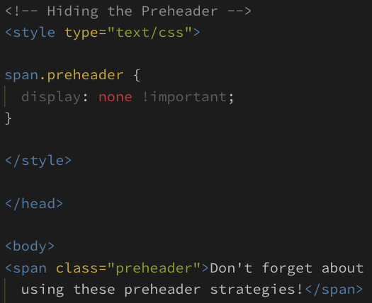
A downside to custom email templates is that you have to update this text every time you create a new email.
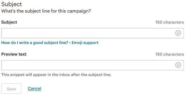
As a Mailchimp Partner, we also build email campaigns with their prebuilt templates. Their user interface is extremely intuitive and easy to use. There is a clear input field where you can add the preview text, making it easy to implement in any email. Take a look:
3 Tips to leave you with:
- When you’re considering your preview text, be sure that the message matches the context of the subject line and the email content itself.
- Make it personal by not showing text that reads along the lines of “View in Browser” but rather a message that shows there is a human behind those emails.
- Have the message stand out by using emojis or asking a question to invoke curiosity.
Maximize the effectiveness of your email marketing by understanding and utilizing all the variables that go into a great campaign strategy—good luck out there!


 Subscribe via RSS