
In web development, cascading style sheets (CSS) are used to style HTML. You can write vanilla CSS, use a CSS framework, use a preprocessor like Sass, or use a combination of all three to style your webpage. There are many different ways to use CSS and many tools to pick from. You might have heard of Bootstrap or Tailwind CSS being mentioned here and there while looking for a framework or tool to use in your project. They’re both CSS frameworks that can help speed up production time — but between these two, which one should you use?
About Bootstrap CSS Framework
Bootstrap was originally released on August 19, 2011. It was initially created by designers and developers at Twitter and used to be known as “Twitter Blueprint”. After Twitter held their own hackathon and publicized the project as an open-sourced framework, the project snowballed as other developers pitched in to help its development. Bootstrap remains free and open-source under the MIT license.
The Bootstrap framework can best be described as a component-based framework. Component-based CSS frameworks are made up of predefined components, or parts, that can be used to style HTML, making responsive website development faster and easier.
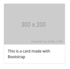
Example:
The code:
<section class="container">

  <div class="row">

    <div class="col-12 col-md-3">

      <div class="card mt-3 mb-3">

        <img class="card-img-top" src="https://via.placeholder.com/300x200.png" />

        <div class="card-body">

          <p class="card-text">This is a card made with Bootstrap</p>

        </div>

      </div>

    </div>

  </div>

</section>
The result:
Layouts
Layout classes help structure the overall layout of the webpage. Bootstrap is based on a twelve column system that uses flexbox grid to build layouts. As you might have noticed in the example above, container, row, and col-* are some of Bootstrap’s layout classes.
- Containers are the foundation of the Bootstrap CSS framework. They contain, pad, and align content.
- Rows are considered as “gutters.” Gutters add padding between columns and are used to space and align content.
- Columns build Bootstrap’s grid architecture. You can decide how columns grow or shrink by using the
col-*classes. In the example above,col-12means to make the content use up all twelve column spaces, or the full width of the container. Then, on medium-sized screens and larger, we only want the content to take up three column spaces. We are able to easily accomplish this by using the classcol-md-3.
Components
Component classes are predefined Bootstrap classes for styling HTML components. Because Bootstrap is a component-based framework, it naturally contains a lot of predefined components for you to use, such as the card component that was used in the example above. It makes styling a UI or user interface significantly faster. Some components that you might find yourself using often are:
- Accordions vertically close and open the accordion content.
- Carousels cycle through elements such as images or text like a slideshow.
- Dropdowns are toggleable overlays for displaying content such as lists of links.
- Buttons component classes style buttons for actions in forms, dialogs, etc.
- Cards are flexible content containers.
Utilities
Utility classes are small and minimal classes that are used to quickly style HTML. Bootstrap has many of these so you don’t have to write your own. In the example above, we used the utility classes mt-3 and mb-3 to add margins to the card. Some useful Bootstrap utility classes are:
- Display utility classes can quickly and responsively toggle the display of components and more. You can hide a component by using
d-noneforxsscreen sizes, and display them when the screen ismdor larger by usingd-md-block. - Spacing utility classes can quickly add margin or padding to HTML elements. Like with the example above, we used
mt-3to add a top margin of$spacer, where$spaceris equal to 1rem. - Text utility classes can quickly control text alignment, wrapping, weight, and more. You can quickly center text by using
text-center, or increase the font size to an H1 tag by using.fs-1, or even the weight by usingfw-bold.
About Tailwind CSS Framework
Tailwind CSS’s first alpha release was on November 1, 2017 according to its GitHub release history. After 43 more releases and over 2,200 commits from 88 contributors, the first stable release, Tailwind CSS v1.0, was made on May 13, 2019. Like Bootstrap, Tailwind is a free, open-source project with a MIT license.
Tailwind CSS can best be described as a “utility-first” framework. Utility-first frameworks are composed of small, simple classes that can be applied to elements to create a user interface or UI. On the surface, using Tailwind doesn’t look too different from writing inline styles. However, what this framework offers is customizability. Instead of being restrained by the premade components from Bootstrap, you can essentially create your own UI with Tailwind to meet your project’s needs.
Example:
The code:
<section class="flex flex-col">

  <div class="flex flex-col md:flex-row md:space-x-3 items-center space-y-3 md:space-y-0">

    <div class="border border-gray-200 rounded">

      <img src="https://via.placeholder.com/300x200.png" />

      <p class="p-5">This is a card made with Bootstrap</p>

    </div>

  </div>

</section>
The result:
Utilities
The core Tailwind CSS framework only offers utility classes. If we want to style an HTML component, we have to do so using only the utility classes and applying them to the different HTML elements. At a glance, it’s very similar to inline styling.
Flexandflex-colutility classes can be used to create a flexbox container with aflex-directiongoing in the column direction.- The utility class
md:flex-rowcan be used to change theflex-directionfrom column to row when the screen size is medium (768px) or larger. - The utility classes
md:space-x-3andmd:space-y-0can be used to increase or decrease the space between child elements. - The utility classes
border,border-gray-200, androundedcan be used together to add a rounded gray border around the element.
Components
The core Tailwind CSS framework does not provide component classes. However, you can pay to get official UI components directly through Tailwind or find some community-made or open-source components for free. You can also create your own component classes by using Tailwind’s @apply directive to extract repeated utility patterns into custom CSS classes.
Comparing Bootstrap and Tailwind CSS
As you can see from the examples above, the two frameworks differ quite a bit. Bootstrap has UI components baked into it, so all you have to do is add your content and flavor to it. Bootstrap’s utility and layout classes provide you with everything you need to style a responsive webpage. With Tailwind, however, you are much more involved in styling the webpage because you end up having to create your own components using the utility classes that the framework offers.
Don’t let Tailwind’s lack of components fool you. Even though it is a utility-first framework, Tailwind is still component-driven. By extracting the utilities into components or template partials, or using the @apply directive, you now have a component. Both frameworks are made to be responsive and they’re both meant to make developing faster than without any framework.
| Bootstrap | Tailwind CSS |
|
|
Verdict
So, which CSS framework should you use? As always, it depends on your situation. If your project doesn’t deviate too much from some of the more common layouts, or you’re more of a backend or full-stack developer, then Bootstrap might be the better framework. If your project requires a lot of front-end customization, doesn’t follow a common layout, or if you’re more seasoned with CSS, then Tailwind might be the better option.
There’s a lot more to Bootstrap and Tailwind. Check out their documentation to learn more about the frameworks and to determine which framework better suits your needs. If you’re stuck and are looking for assistance with web development, get in touch with the experts at Hall.