Access to information is something we take for granted. The internet has only been (commercially) available for just over 20 years, and has come a long way in a pretty short time: from dial-up modems, to disc-based programs and video games, to the point where pretty much any electronic device has Wi-Fi (do refrigerators really need this?).
Traditional media has seen a radical shift as well with the web growing by millions of text entries a day. This new level of information and connectivity gives companies many more platforms to connect with clients (or potential clients) and, with the advent of social media, a means to engage customers on a more personal level.
One of the biggest challenges in our industry is the constant struggle to stay relevant. It often seems like as soon as we feel competent with one platform a new one emerges on the horizon that promises to (and often does) change the landscape of how we connect to customers. Evolving and adapting is a necessary skill in our industry, it’s why many of us love it, but once in a while, in an effort to be ahead of the curve, we forget about how best to address the market as it is today.
One of the biggest online marketing shifts started happening in the mid 2000’s once smartphones came onto the market. Users were now able to access websites and information from any location, but that also meant a big shift in how to optimize web experiences to fit a rather limited physical space. Then came the tablet, which offered a somewhat happy medium in sizes between desktops and mobile phones. And don’t even get me started on the various screen sizes…
The past couple of years have become a “sky is falling” mentality for online marketing, as a lot of gurus have started spreading the “if you don’t adapt your focus to mobile or tablet, you will crumble and die” message to all business owners.
If we were to listen to a majority of marketing agencies, one would assume that Mobile/Tablet devices count for around 85% of the platforms being used to access the web and that traditional Desktop users are dying off faster than folks who use land-line telephones.
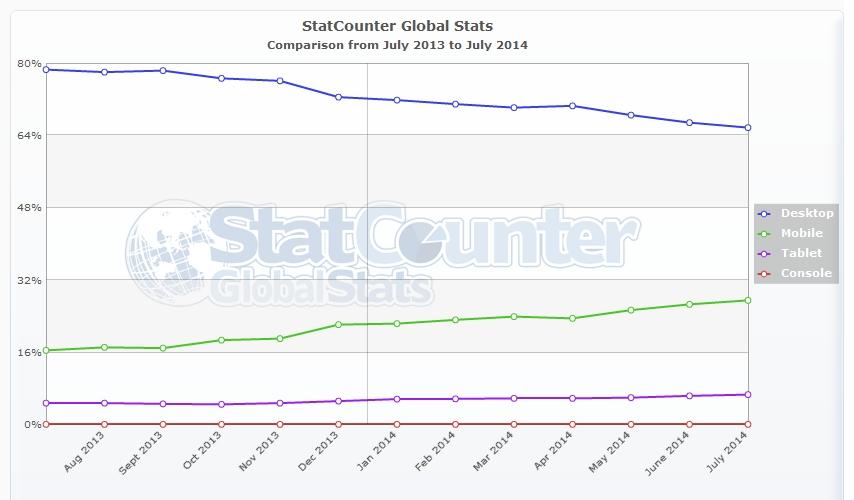
Here are some real world stats on what Platforms are most popular as of July 2014:
- Desktop: 65.71%
- Mobile: 27.51%
- Tablet: 6.68%
- Console: 0.11%
Don’t rub your eyes too hard. To be honest, I actually thought the Desktop percentage would be under the 50% mark, but that’s not the case.
So, this leads me to think: Are we starting to ignore Desktop users? I think a majority of marketing companies would have to answer “Yes.”
Now, don’t get me wrong. I’m fully aware that the percentage of Desktop users is shrinking yearly, (See below as Desktop fell from 78.56% to 65.75% from July 2013 to July of 2014), but that doesn’t mean they should be ignored. They are still the majority of web users, not to mention the added flexibility that desktop setups have when it comes to word processing, multimedia and multitasking. Plus, the majority of desktop users are business professionals, which are among the highest targeted demographic.

But, as always, technology is evolving and responsive websites are on the rise. With a properly designed responsive website, we can now ensure that each platform will have a similar user experience. Part of the problem with having separate Desktop and Mobile site versions is that the Mobile version of the sites were usually a truncated version of the full site (not to mention the negative SEO impact of having duplicate content on two sites). If designed and developed properly, you can consistently address all formats while skewing the page layout (not the content) to fit and adapt to any screen size, be it Desktop, Phone or Tablet.
The biggest key is to remain flexible. Even if you feel that your audience is tuned into one specific platform, always plan to reach users you don’t account for or aren’t in your core demographic in all avenues.
It’s always better to have-and-not-need than to need-and-not-have.


