This is an entry in our daily Internet Marketing Advent Calendar series. Each day your favorite marketing elves will focus on a new topic to get your internet marketing in order before the start of the new year.
Every year Santa makes a list and checks it twice. What is he doing when he checks it multiple times? I think he’s digging deeper into his memory to decide which list each boy and girl will eventually end up on.
Just like when Santa makes “the list” as the first step in assessing the behavior of the children; we look at web analytics to assess the visitors of our website.
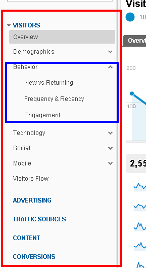
It’s easy to see high level data about your website like how many people have visited your site in the past month or what the site’s bounce rate is – but what about their behavior? Google Analytics makes it easier for you to understand the types of people visiting your website using Behavior Reports (Figure 1.1 below).
What can you see in Behavior Reports? What insights can you learn from these reports?
New vs. Returning – This report shows a ratio between the new traffic as compared to the returning traffic to the website in a given time period.
- If you have a high percentage of new traffic that means you’re doing a good job of making your site visible online.
- If it’s low then you’ll want to review things like your SEO, social network profiles, content strategy, and even directory listings to include your URL. You might even want to create a PPC campaign to obtain new traffic.
- If you have a high percentage of returning traffic that means that the content on your site is helpful and people are continuing to return for more. Maybe you have a login section for current customers or a training section that gets a lot of return visitors. If this is the case, make it easy for your returning traffic to find the content they are seeking quickly.
- If your site isn’t getting a lot of return traffic you might was to assess things like your blog or FAQ section. Is there information important enough for people to return back?
Frequency vs. Recency – This report helps indicate how interested people are with the information provided on your website.
- One view displays Counts of Visits (frequency) and the other displays Days Since Last Visits (recency).
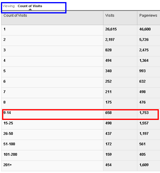
- Counts of Visits shows the number of times users have viewed the site in a given time period, how many pages were viewed as compared to the percentage of the total visits.For example (Figure 1.2 below) you can see that 54 visitors have come to the site 9-14 times in the given time period and viewed 129 pages in that time frame. In most cases you’ll notice that those that only visit the site once account for a majority of the visits in a certain time frame. You may notice the counts of visits decrease after 1 and then spike back up at 3 or 7 which might help you understand the research/buying cycle of your audience better.
- Days Since Last Visit shows similar information but you’re looking at how many days lapsed since the previous visit. Many times, if your site gets a high percentage of new traffic most of the visits are coming from people who account for “0 days since last visit” in this report. However, this report will help you understand how often the people that are using your site are returning back for more information. Do you post your blog on the same day each week and people are returning to the site because of that? This can also give you some feedback about offering a promotion or changing certain sections of your site to keep it fresh for users that are returning.
 click to enlarge | Figure 1.1 |
 click to enlarge | Figure 1.2 |
Engagement
- The engagement report is measured by Visit Duration or you can see Page Depth. These are similar to the data you can see in the Overview Report (Avg. Time on Site and Pages/Visit). With this report you can see how engaged your site users are by understanding how long they are spending on your website and how many pages they are viewing each time they visit.
-
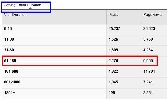
The Visit Duration report shows the duration in seconds and the respective visits of each time range. This shows you how engaged with the site the users are in relation to the time they are spending on the site. For example (right), you can see that 187 visits occurred where the users stayed on the site between 181 and 600 seconds (3 – 10 minutes). Pay attention to the amount of time that you see users are the most engaged and viewing the most pages; this could be a goal to aspire to for your site. If you notice that people that stay on the site for 181-600 seconds have the highest pageviews (except for 0-10 segment) then look to this as a goal for the site; to have the avg. time on site be 3 minutes.
- You can understand the engagement of the site visitors in a different way by looking at the Page Depth, or how many pages people are visiting when they come to your site. Chances are the highest number will be 1 page and then the traffic will taper off; make sure the traffic doesn’t merely drop off.
Dig Deeper into the Data
These reports are just the tip of the iceberg. You can always learn more about your site’s user behavior by adding second dimensions to the reports. For example, if you’re reviewing new traffic vs. returning traffic you can select “source” as a second dimension. This will break down and show you, of those who came to your site via “Bing” how many were new and how many were returning in a given period. Also, with each report you can add advanced segments to filter the report in order to obtain more granular data. You can always dig a deeper to understand your site traffic behavior better.
Remember, it’s all relative.
You better not pout and you better not cry! There is no ideal number for everyone to try to reach for each of these reports. The key is to understand your site goals and which milestones you should track to make sure you’ll meet your goals. Plus, when it comes down to it the more you learn about your audience the better you can serve them; just like Santa finds out what all the good children want for Christmas.

