
Web forms provide a critical pathway between your business objectives and your customers. There are many different types of forms, but the objective is the same — to get the user to convert — to make the form engaging, enticing, and easy to fill out and submit, whether it’s for an eCommerce order, a newsletter subscription, a general inquiry, or something else. The user experience of the form shouldn’t be a barrier to conversion. Let’s take a look at some best practices to keep in mind.
Layout & Design
Page Design
Forms should be placed towards the top of the page — above the fold — before scrolling is necessary; we want it to be immediately visible when someone lands on the page. The objective should be clear and enticing to the user, injecting a sense of urgency through language and design elements. Include an enticing call to action at the top and reinforce this language in the submit button text.
Form Length
If there’s a lot of information to collect, it may be wise to break up the form into distinct sections with clear and semantic headings. Another option is to create a multi-stepped form separated into multiple pages with next/previous buttons to navigate between. Long applications or eCommerce order forms could benefit from such an approach.
Let’s also question if all the fields are necessary at this stage of customer interaction. Do we need all these fields? Can we remove anything and ask for it later? Customers may be more reluctant to fill out a form if a phone number is required vs. making this optional. We want to eliminate all barriers to conversion.
Columns
While it’s tempting to arrange form fields into columns, this is actually a less desirable user experience as it makes the form harder to scan, causing required fields to get overlooked. One column layouts are also simpler to implement across all devices and screen sizes.
Form Fields
Labels
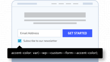
Form labels should always be prioritized over placeholder text. On shorter forms, it may be tempting to replace labels with placeholder text to save space, as text is contained within the input itself and not outside of it, but doing so creates problems. As a user begins typing into the input, the placeholder text is no longer visible. Without this prompt, users can forget what the field is asking for which causes frustration. In addition, placeholder text usually has a lower contrast to distinguish it from the inputted text, making it difficult to read for visually impaired users. It is also often used to communicate formatting information that should exist in the label or a separate description. Placeholder text alone is not sufficient for accessibility conformance and still requires a hidden field label. All of these scenarios are undesirable and contribute to accessibility issues.
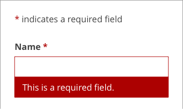
Required fields should be communicated and marked up accordingly. The adopted standard has been to represent this as an asterisk beside the field. Don’t presume all users understand this; and make sure it’s communicated that this means “required.” You can also specifically call out which fields are “optional” for added assurances.
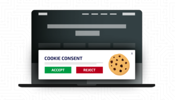
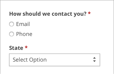
Radio vs. Checkbox vs. Select Inputs
If providing the user a list of options to choose from, we first need to decide if they are allowed to choose one or multiple options. If we are only providing 2-6 options, we should use radio (single choice allowed) or checkbox inputs (multiple choices allowed); if we are providing more than 6 choices, a select or multi-select dropdown input should be used. Make sure the label is always visible amongst the listed options to avoid confusion.
Input Size
A postal or zip code field requires far fewer characters than a street address so the field width should be sized according to actual values. This provides a quick visual cue when scanning and debugging if there are errors.
The input height should be tall enough for clicking (mouse users) and tapping (touch users) into the input. There should be enough padding around the text so it’s not bumping up against the edges and hindering legibility. The font size should inherit the body size (default is typically 16px) so there’s no need to set this specifically; on some mobile devices, it will zoom in on the input if the font size is larger, disrupting the user experience.
Error Handling
The first thing we want to do is help to mitigate user errors by making sure the language is clear and the expected input is understood by the user. All inputs should be chosen properly and marked up accordingly. There are a number of different field types available: text, textarea, radio, checkbox, select, number, telephone, email, search, etc. If a number is required, use a number field, not a text field. If a date is required in a specific format, consider breaking this up into multiple fields for month, day, and year instead of one field. Use autocomplete attributes where appropriate such as email or name to quickly populate fields saved to the user’s browser. For address fields consider setting up autocomplete via the Google Maps API; this could greatly cut down on support issues for eCommerce shops. Ensure labels are associated with the form field for accessibility standards and spacing is adequate to discern which label corresponds to which input.
When errors do occur, we want to make sure users can quickly resolve them and move along without frustration. Use color cues such as red to designate invalid fields and green to designate valid fields. Color alone is not enough, so proper ARIA markup for screen reader users is necessary as well. Ensure the user understands what the error is, in which field it has occurred, and how to correct it.
Confirmation
Let’s not overlook what happens once a user submits the form. There are several ways to thank the user for their engagement, but a dedicated thank you page affords us the most opportunities.
On the thank you page, you can:
- Properly thank the user
- Let the user know when they can expect a reply or delivery of goods or services
- Provide a recap of what was submitted
- Include a secondary form with additional questions
- Include additional resources or pathways of interest back into the website
We want to keep the user engaged and excited. The thank you page doesn’t have to be an exit page.
To recap, forms are one of the most important aspects of customer engagement on the web. Good user experience is tantamount to a highly-engaging and well converting form, and no aspect, from design, language, field type, markup and accessibility, should be overlooked.