Design trends can be difficult to stay on top of and this is never truer than in the field of web design. Not only do trends come and go as our tastes change and develop, but major shifts in technology make possible new features that were previously unobtainable. As designers and developers we try and keep our ear to the ground more than most, taking note of the sites we like, and what we like about them. We then try and incorporate what we’re seeing into our work and make it our own.
Here are three of the major movements I’ve seen really establish themselves so far in 2015, and a few examples where they’ve been used particularly well:
Responsive Design
One design for all devices. This trend has been making waves since its inception around 2010, but we are now starting to see it implemented across many modern sites. Responsive design is an approach aimed at building sites that provide optimized viewing and an interactive experience on any device.
Effective responsive design focuses on easy reading and navigation and minimizes the need for re-sizing, panning, or scrolling. Not to mention, it works across a wide range of devices from desktop computer monitors to mobile phones. This trend is a no-brainer for anyone looking to build a new site this year.
To see an example take a look our website: hallme.com.

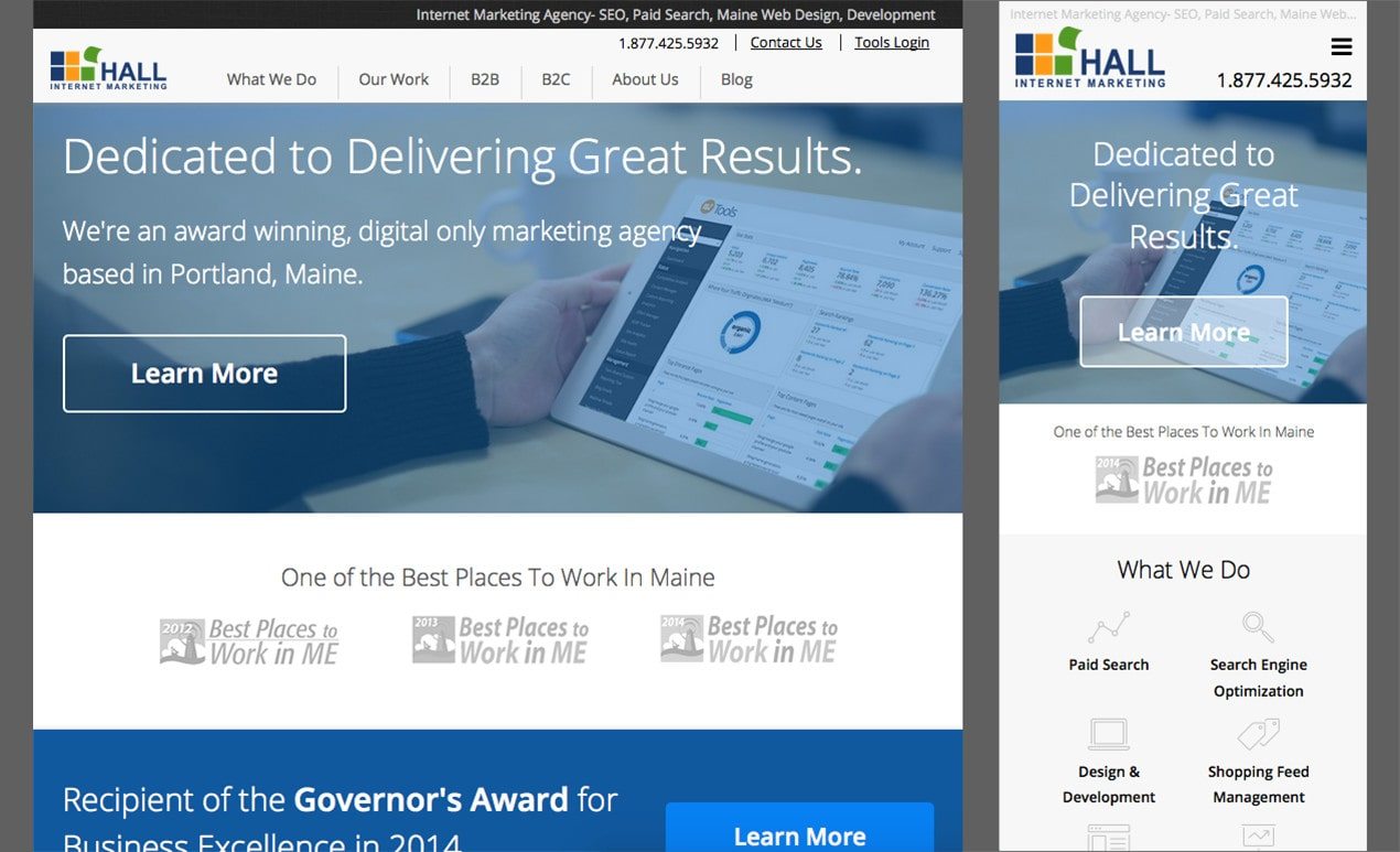
If you’re reading this post on a desktop computer try grabbing the edge of your browser and re-sizing the window. You can see that as you reduce the screen size on any page, it responds to the new size and gives you a great view of the content. In the images above, I captured views of the same page from a desktop, tablet, and mobile device.
Parallax
Here is a trend that has exploded in popularity in the last couple of years. So what exactly does parallax mean? In the vernacular of web design, it’s when the background of the website moves at a different speed then the rest of the page for an impressive visual effect, adding depth to a two dimensional page.
Take a look at a website we recently built that utilizes this technique: http://www.cashstar.com/

As you scroll down the site you start to notice two layers. The top level which holds all the text and content, while the background layer contains images. This effect allows you to scroll past one another to give off the feeling of speed differentials. This technique can be utilized in many ways on your website, but I find that using it to break up different content types is a really nice way of incorporating it into my designs.
Simplicity
Less can definitely be more. There is a principle in design which states that a design is complete when all of the non-essential elements have been removed. The trend of simplicity has definitely gone main stream in web design (just look at Apple, the world’s most valuable company). Personally, I hope this trend stays around for a while.
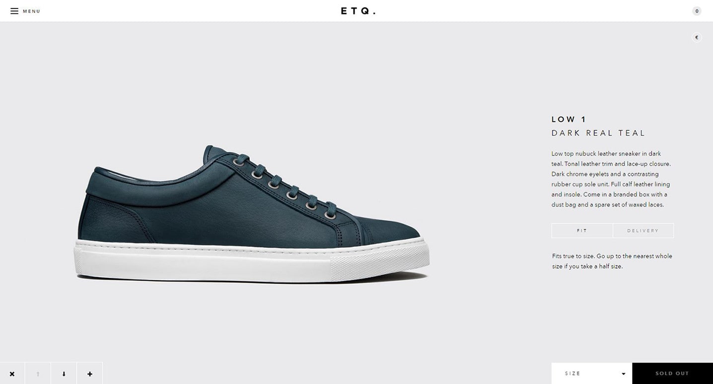
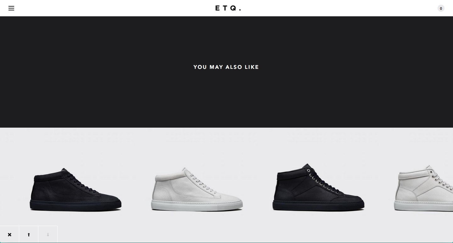
In the images above I have shown an e-commerce store that sells shoes. The elements on the page have been boiled down to the absolute bare minimum. A product, buttons to select size and order, and below a section for cross promotions with similar products. Not only does this design make it easier for the end user to stay focused on the product, but it also allows the product to speak for itself. This trend shows no indication of slowing down anytime soon.

