Web design is inherently very subjective, but if you approach everything from a user experience (UX) perspective, things become far less subjective. What does this mean? Because the web requires varying degrees of user interaction, these are all actions that can be tracked, analyzed and refined. Clear patterns begin to emerge on what things frustrate and convert users. A utilitarian approach is better than an aesthetically pleasing one. Maybe you think that’s a ridiculous statement but think about the sites you most enjoy using. There’s a good reason why Google’s homepage is so sparse, focusing only on what they do best. Here are some UX tips to consider when approaching a redesign.
Do this before anything else and always REPEAT!
Identify pain points.
Where are users failing to convert?
Remember that what “works” from your point of view is not necessarily reflective of your audience. You may be too close to the project to understand what is really going on. Consider new users and returning users. Outright ask users where they are struggling, why they are leaving? Provide surveys or questionnaires with incentives to answer. Set up heatmaps and recordings with such tools as Hotjar or Concurra and find out how far users scroll, what they click on, where they focus their mouse most often, how they interact with the page. These provide useful insights on what needs to improve. From there you can set up A/B tests to fine tune your findings even further by providing users with alternate variations and tracking the different conversion rates between them. For more information on A/B tests take a look at: 4 Tips for Running a Successful A/B Test.
Consider these things throughout!
Content is always the most important thing!
Your users are only there for the content so make that the priority.
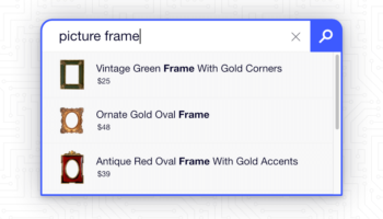
They are not there for the design. It should not be difficult for them to find what they came for. Content does not necessarily mean only paragraphs and paragraphs of text that no one reads (really, when was the last time you read an entire article or page from top to bottom?). If you have an E-Commerce shop, images may be the most important piece of content and should help drive sales, not discourage them. If you provide some kind of service, the phone number and address should be readily available. If you have a wealth of helpful information, it should be structured and organized in a meaningful way and/or provide a search form.
Stay focused on the big picture.
What makes you money?
Are you an E-Commerce shop? Are you focused on lead generation? Too often clients lose track of the “big picture” by focusing on the minutiae. Remember, print design is nothing like web design. Things can change and they should change and evolve! Don’t be afraid to try something for a short period. If it doesn’t work, it doesn’t work; now you know for sure, try something else instead.
Less is more.
The common design rule, KISS, applies here as well. Keep. It. Simple. Stupid. Don’t make it harder than it has to be. Simplify as much as possible. Don’t go over the top with flashiness, subtlety is key; if it detracts from the goal of providing important content, it’s not worth it. Find out what’s most important to your users and get rid of the clutter.


