 As web design trends continually move toward a larger graphical dominance, developers need to consider the most effective techniques for dealing with responsive images, keeping in mind both performance and user experience. Performance is always a substantial consideration in the development process and images can greatly slow down page load times. The smaller the file size, the faster the website will load. User experience is also an important consideration and ties closely with performance. How much screen real estate does your logo need on mobile vs. desktop? What is the user focus on mobile vs. desktop? New user vs. repeat user? As monitors continually grow in size and mobile devices continually grow in numbers, developers are burdened with the task of developing websites to suit as many of these users as possible, which needless to say, is not an easy task. We will go over some responsive image techniques that developers employ when developing for WordPress and how the WordPress user can maintain best practices.
WordPress Techniques for Developers
The oldest, easiest and most widely used technique is to set all image tags to max-width: 100%; height: auto; in the CSS. This forces the element to resize relative to it’s parent without constraining its proportions. This is very easy to accomplish but what happens when you have a very large image say 1240px wide at 3MB on a mobile device? This image, now only 320px wide, is still loading the full version at 3MB, slowing down load time.
The solution is to serve a smaller version of the image with media queries in CSS. We establish a set of breakpoints starting from smallest to largest. It’s good to set breakpoints at 768px and 1024px for tablet users. The best rule of thumb is to set a breakpoint if the design requires it vs defining a rigorous set of breakpoints from the outset. This way we can serve an image with a much smaller file size to a mobile user vs a desktop user and improve the performance and page load time.
WordPress allows us to define a series of image sizes with the function add_image_size(). When an image is uploaded in WordPress it will crop the image to the defined sizes without destroying the original, instead appending the specified dimensions to a new image, for instance the original—cute_dog.jpg and a thumbnail version—cute_dog-150×150.jpg.
In order to serve these images dynamically, we need the help of javascript, otherwise we would need to define the separate images in CSS which is not user friendly. There are plugins that can accomplish this task; Jetpack is one. Jetpack uses Photon to serve images.
Photon is an image acceleration and editing service for sites hosted on WordPress.com or on Jetpack-connected WordPress sites. That means less load on your host and faster images for your readers. Photon looks at the img element’s width and height attributes and then serves an image resized to those dimensions or to the width of the containing element (whichever is smaller).
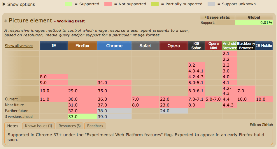
Another way to serve separate images is through the new picture element established in HTML5, though this technique has very little browser support at this time as shown below; the pink background signifies “no support”. It is, however, an exciting step forward and can easily be integrated into WordPress as demonstrated by Chris Coyier utilizing Picturefill, a javascript polyfill (or helper) to enable the use of the picture element today.

The picture element uses source tags to define separate images with attributes to specify specific breakpoints.
<picture>
  <source srcset="examples/images/extralarge.jpg" media="(min-width: 1000px)">
  <source srcset="examples/images/large.jpg" media="(min-width: 800px)">
  <source srcset="examples/images/medium.jpg">

  <!-- fallback -->
  <img srcset="examples/images/medium.jpg" alt="alt text">
</picture>
WordPress Techniques for Users
There are a few things to consider when uploading an image for use in a page or blog post. How large is the file size? What dimensions does the image need to be for optimal viewing? Is the image very important in support of the content or is it secondary?
Native to WordPress
- Select a “size” in the right sidebar of the “Add Media” window before pasting into the editor.
- Click the “edit image” link from the media library to make adjustments.
Reducing File Size (with image editing software)
- Save an original copy of the image before making any alterations to it.
- Scale or crop the image to a desired size. Remember, in most cases the image does not need to exceed the width of the content.
- Save the image around the 80% quality range (this is not possible with transparent PNGs but the file size can still be reduced with a compression tool below).
Reducing File Size (with free online compression tools)
- http://compressjpeg.com/ (JPEGs)
- https://tinypng.com/ (Transparent PNGs)
- http://www.smushit.com/ysmush.it/
- http://compressor.io/compress (JPEG, GIF, PNG, SVG)


