
Before ::marker, if you wanted to customize the look of your list-items, one option was to change the list-style-type property to select a new marker from a list of options while the color of the marker was linked to the color of the text. You could change the disc to a square, a circle, or various alphabets.
You could also use list-style-image and provide a URL to an image to replace your marker.
If you wanted to change the color of your marker, and have it be unique from the color of your text, that’s when things got more complicated:
Old way to change bullet color
ul.old-color-change {
    list-style-type: none;
}

ul.old-color-change li::before {
    content: "\2022";
    color: coral;
    font-weight: bold;
    display: inline-block;
    width: 1em;
    margin-left: -1em;
}
This involved removing the original bullet, adding a pseudo-class ::before selector to add back in our bullet using the unicode of a bullet, and additional styles to color, size, and position the bullet.
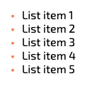
Changing the marker color
With the new ::marker pseudo-element, changing the color of your bullet is as simple as:
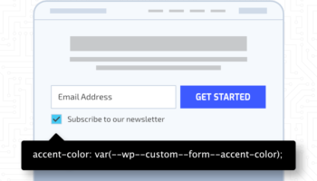
ul.color-change li::marker {
    color: coral;
}
Changing the marker content
It’s common to want to use an icon from Font Awesome in place of your marker. You can achieve this using the new ::marker in the following way:
ul.marker-content-change li {
    padding-left: 0.5em;
}

ul.marker-content-change li::marker {
    font-family: 'Font Awesome 5 Free';
    font-weight: 900;
    content: '\f35a';
    color: coral;
}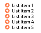
Changing the content of the marker will most likely require some space to be added between the marker and the list-item text. That can be achieved by adding some padding to your list item and is noted above.
Changing the marker content on hover
You can also combine the pseudo-class of :hover with ::marker to display your marker differently when hovering over your list-item:
ul.hover-marker-content-change li {
    padding-left: 0.5em;
}

ul.hover-marker-content-change li::marker {
    font-family: 'Font Awesome 5 Free';
    font-weight: 900;
    content: '\f35a';
    color: coral;
}

ul.hover-marker-content-change li:hover::marker {
    font-weight: 400;
}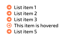
In the example above, the solid vs. outlined arrow is set via the font-weight property. Changing the marker font-weight when a list-item is hovered over changes the icon.
The new ::marker pseudo element allows you to change the appearance of your marker more quickly and consistently than ever before, making your lists unique to your brand.
Note: While ::marker is supported in all modern browsers including Edge, Firefox, Chrome, Safari, and Opera, it is not supported by Internet Explorer 11.
Learn more about the ::marker pseudo-element at the MDN Web Docs.